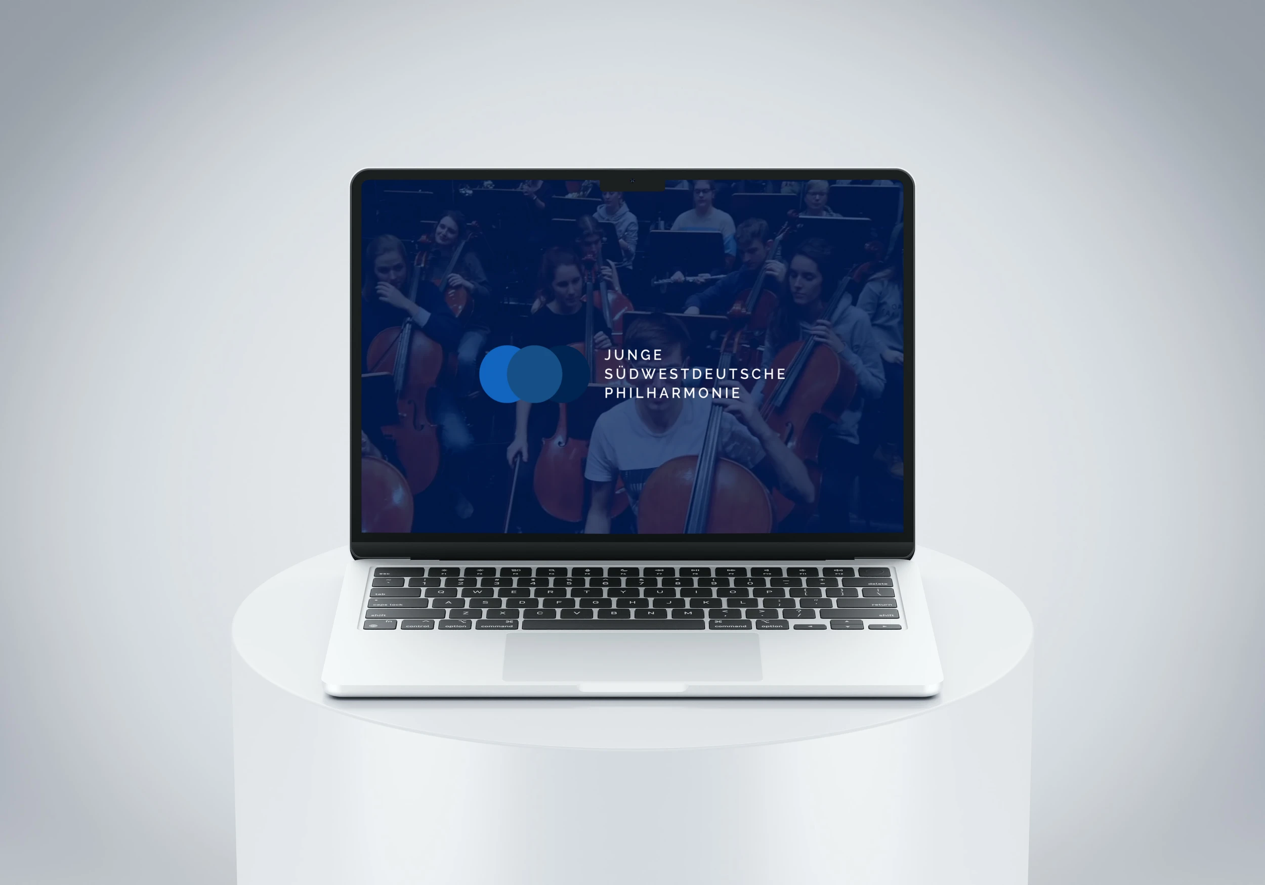
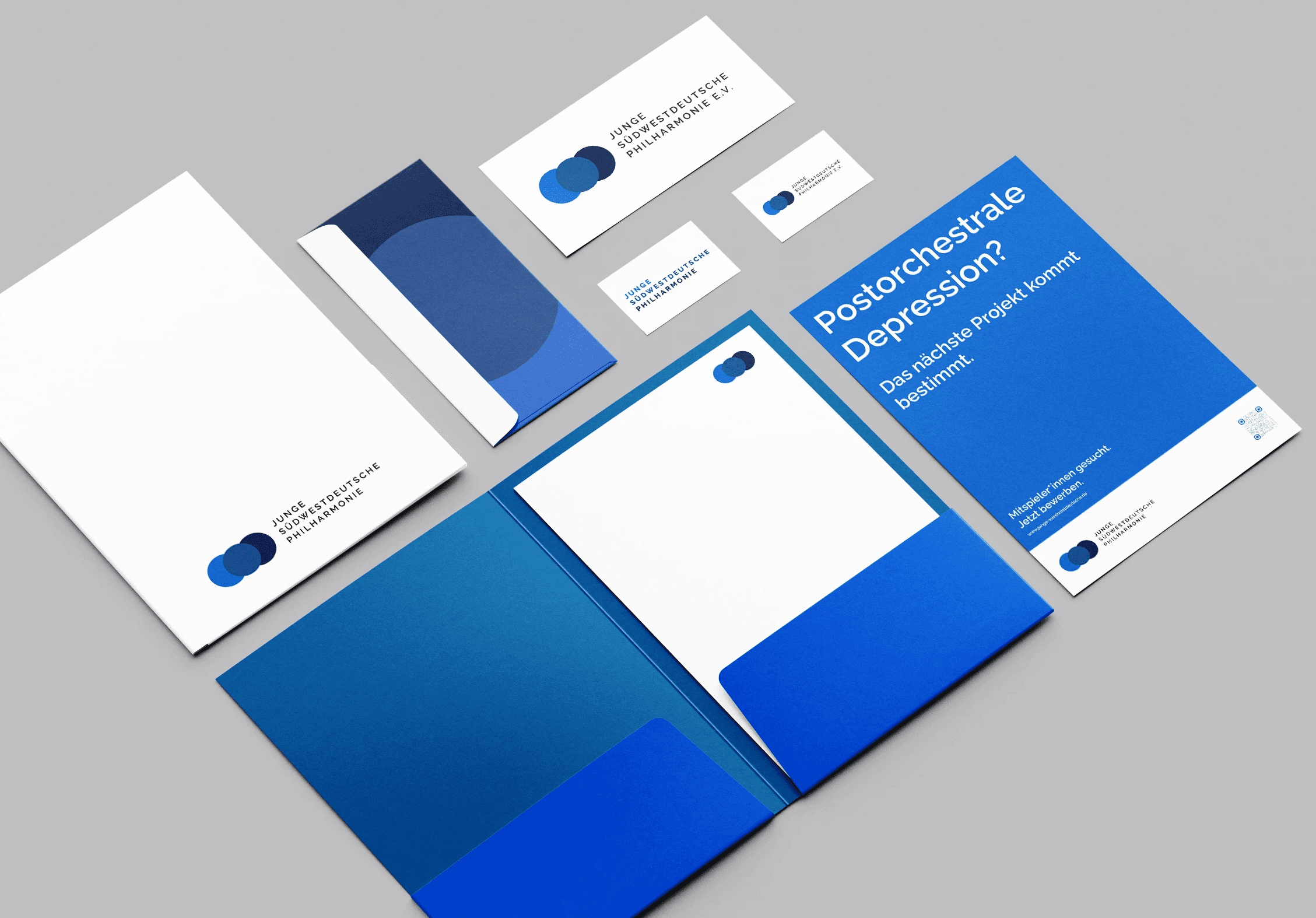
Three circles, three shades of blue, one shared centre. A new corporate design with logo, stationery, campaigns and website was created for the Junge Südwestdeutsche Philharmonie.
The symbol translates the orchestra's founding idea directly into form. The two outer circles represent ambitious amateur musicians and aspiring professional musicians, while the central circle represents their encounter in the shared orchestra. The entire visual identity develops from this principle, from overlapping fields to the three defined shades of blue.
Raleway was originally designed by Matt McInerney as a single Thin weight and later expanded into an extensive type family. Its geometric forms and open proportions shape the wordmark, posters and digital applications.
The JSWP brings musicians with different educational paths together in shared projects. This open, collaborative principle not only shapes the orchestra's working method but also forms the starting point of its visual identity.
www.junge-suedwestdeutsche.de